Website Designs
Topic: Web Technologies, Date: 16/12/2015Description
This project is a congregation of some of the designs and animations I was playing with when creating my Web Technologies coursework. The first one I am going to show you was the idea of a water selling company. For this idea, the main gist was the background animation as the coursework required that there must be a canvas animation present to spruce up the site. It is made by simply filling the area beneath a sine wave. Then animating the area beneath the sine wave using the setInterval() function and changing the parameters to the sine wave function. While I am aware of the window.requestAnimationFrame() function, which is the recommended way of creating animations using javascript, setInterval() was simple enough to make this. The main code for drawing the sine wave and the animation are shown below.
Wave
Sine Wave Code
//Set the animation interval
setInterval(function() {
    context.fillStyle = "white";
    context.fillRect(0, 0, canvas.width, canvas.height);
    fillSinWave(0, canvas.height / 2, canvas.width / frequency, amplitude, frequency, offset);
    offset += 0.1;
}, 20);

//Fill under a sine wave
function fillSinWave(xPos, yPos, distance, amplitude, oscilations, offset) {
    for (var i = 0; i < distance * oscilations; i++) {
        var y =  yPos - Math.sin((2 * Math.PI / distance) * i + offset) * amplitude;
        context.fillStyle = "lightblue";
        context.fillRect(xPos + i, y, 1, canvas.height - y);
    }
}
Observatory and Omega
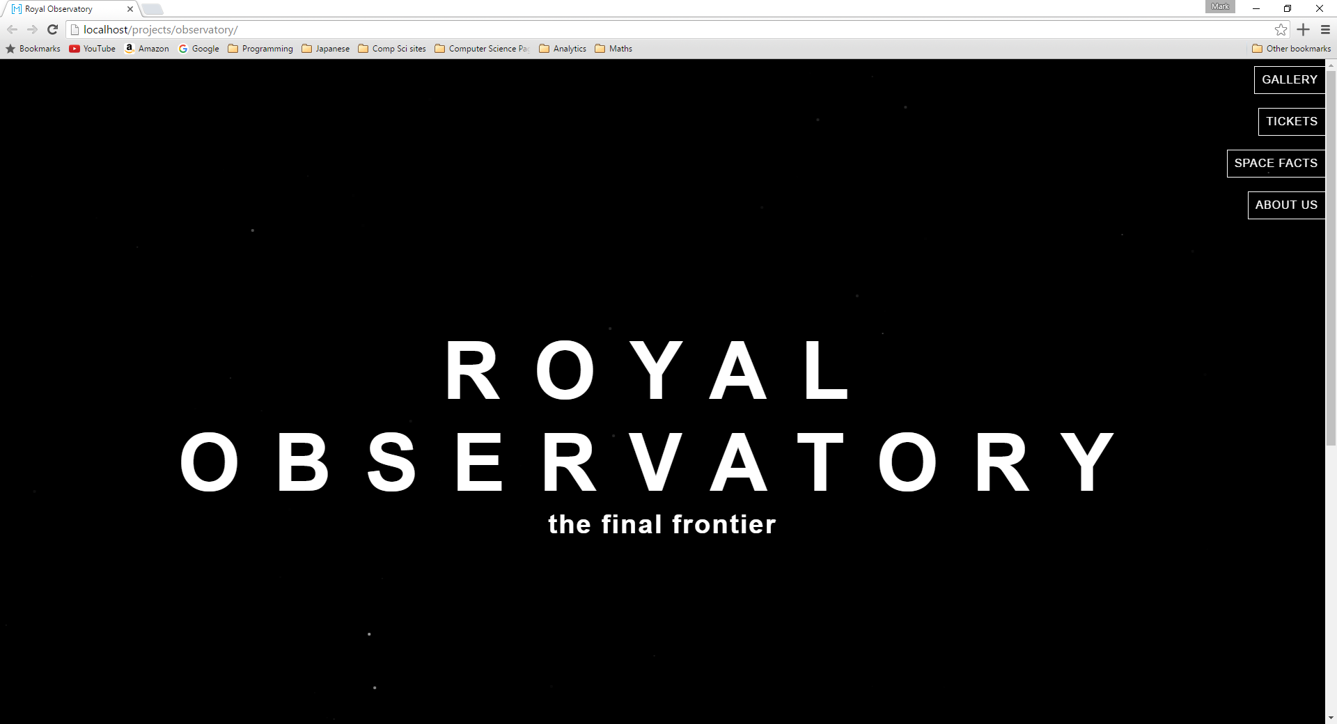
There were a few other prototypes which were made along side this one. One of which was an observatory where the animation was stars twinkling in the background. That template can be seen here. Keep in mind that these were not finished as I decided to pick a different topic altogether. This is why there will be some display issues regarding responsive design, such as the space facts page on the observatory site.
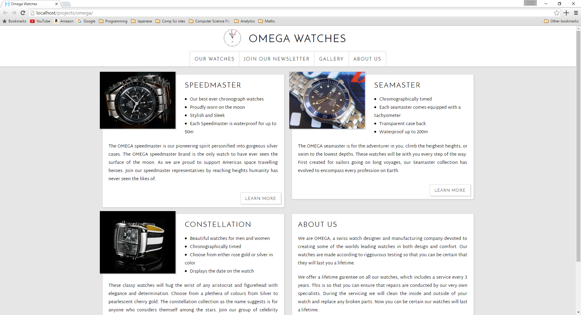
The finished design was for a watch company Omega (of course this is purely fictional and in no way actually affiliated with Omega). The animation this time was a small watch face which also acted as the home navigation button. There are a few strange features that the site also had to implement other than the animation. Which is why, in the footer, there are also some buttons which change the background color for the navbar as well as the font size. In the gallery there had to be an animation to increase the size of the images, this formed the basis for the image code on this site too! This piece of coursework was enough to earn me a mark of 89%.
Screenshots:

